User Interface
Dark Moon alters the UI in various ways.
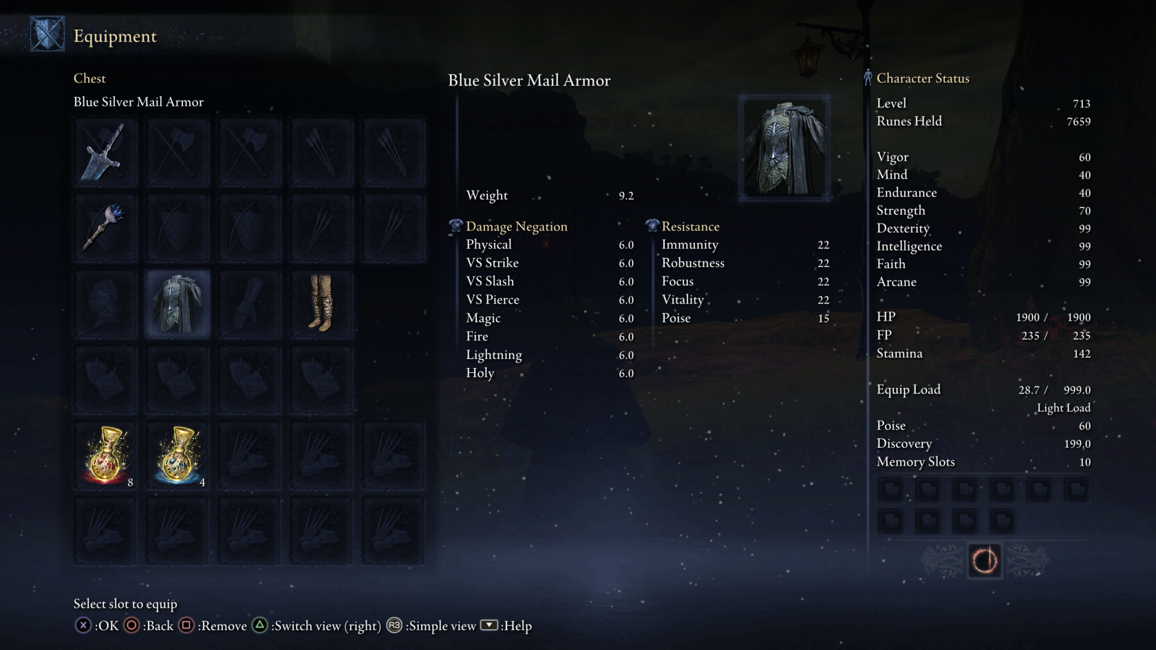
Visual UI Overhaul
Dark Moon has a recolored interface to match the overall branding. Not a huge change, but hits where it counts.
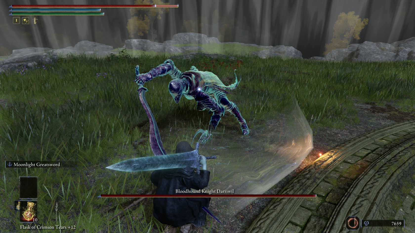
Simplified HUD
HUDs in Souls Games have always been quite busy and while Elden Ring made some good strides in reducing clutter, it still feels a bit cramped. Dark Moon's HUD has been altered slightly to be simpler.
- HP, FP, and Stamina bars have been moved closer into the top-left corner.
- Equipped weapons are no longer visible in the HUD.
- Great Rune icon has been moved to the left side of the Rune counter.
- The compass has moved up slightly.
- Boss names have been center-aligned.
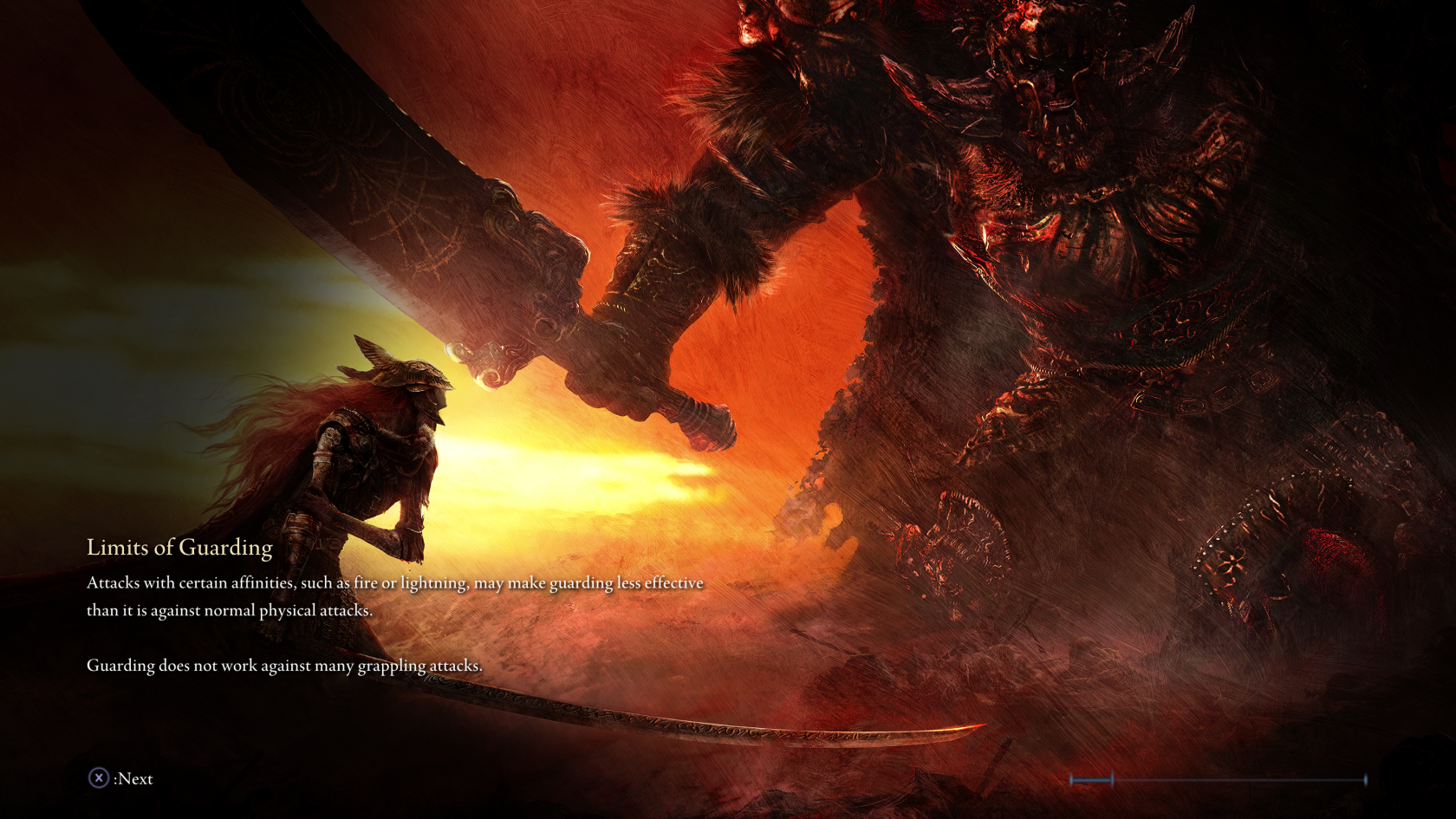
New Loading Screens
The loading screens have been replaced with concept art and the art from the game’s intro. This tweak is an updated version of theEvi1Twin’s Intro and Concept Art Loading Screens mod. I basically just added a vignette to each loading screen to make the hints more legible.


No comments to display
No comments to display